This function allows you to create cool circular packing charts easily by providing just the data and a template among the available ones. Moreover, you can choose whether and where to display percentages and also optionally specify a title for the chart.
bubble_blow(data, template, perc = "no", title = "")Arguments
- data
A data frame (or a tibble) with two variables (columns):
in the first one there must be the vector of labels;
in the second one there must be the vector of values.
You can usepie_datacheckto understand if the data is suitable.
- template
The chosen template.
The available templates for this function are 'bub1', 'bub2', 'bub3', 'bub4', 'bub5'.- perc
You can choose among:
'no' : the percentages won't be displayed (default choice);
'below' : the percentages will be displayed below the group labels;
'right' : the percentages will be displayed next to the group labels.
- title
A string. If you want, you can specify the title of the graph.
Value
A ggplot object. In particular, this function returns a circular packing chart according to the data, the choice of the template, and the other specifications provided.
See also
See all the available templates displayed here!
Examples
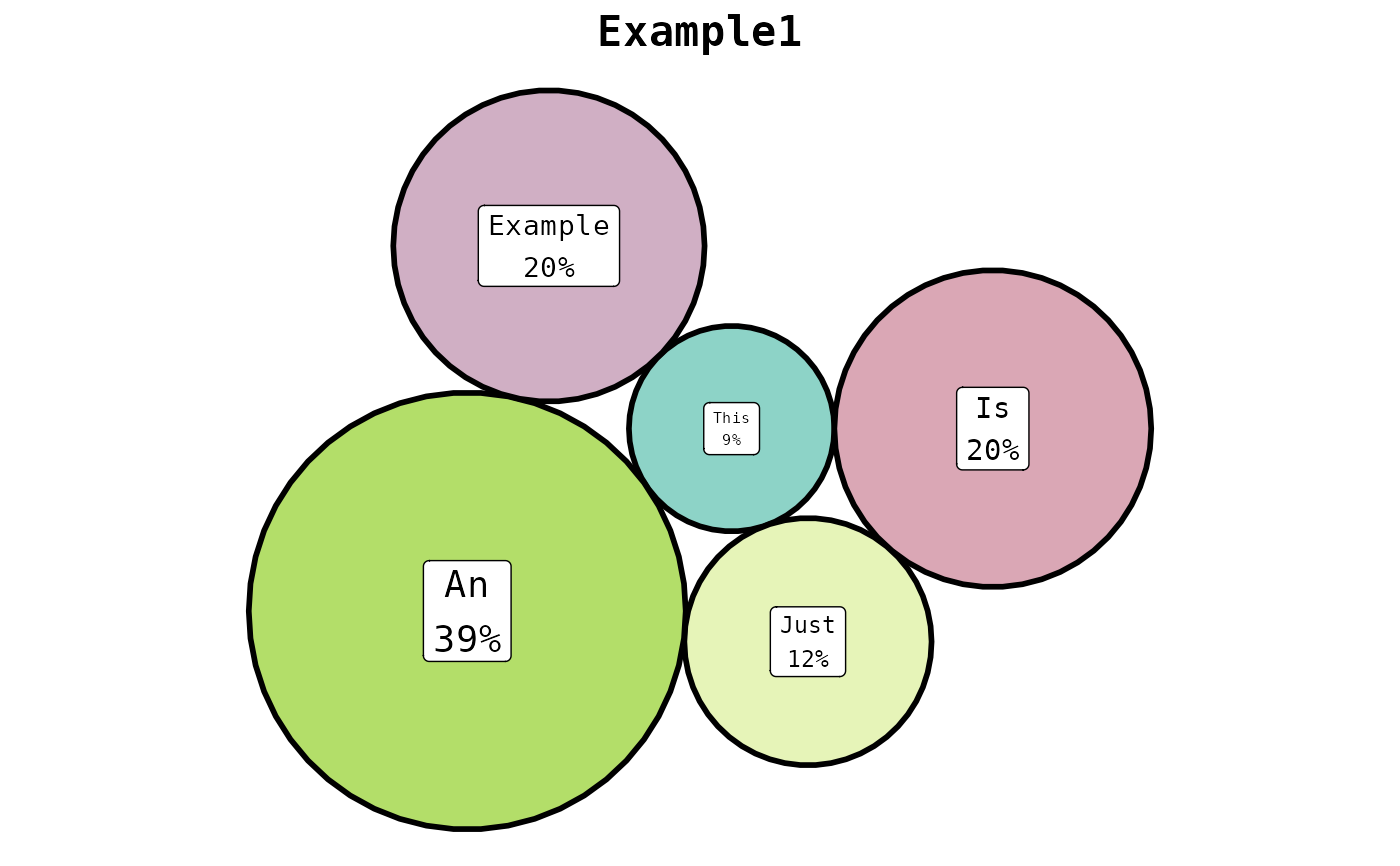
example <- data.frame(
c("This", "Is", "Just", "An", "Example"),
c(2.9, 6.9, 4.20, 13.12, 6.66)
)
bubble_blow(
data = example,
template = "bub1",
perc = "below",
title = "Example1"
)
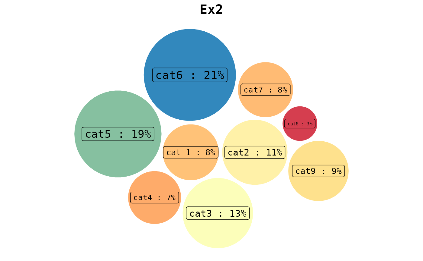
 example2 <- tibble::tibble(
c("cat 1", "cat2", "cat3", "cat4", "cat5", "cat6", "cat7", "cat8", "cat9"),
c(324, 432, 499, 291, 750, 836, 314, 133, 372)
)
bubble_blow(
data = example2,
template = "bub2",
perc = "right",
title = "Ex2"
)
example2 <- tibble::tibble(
c("cat 1", "cat2", "cat3", "cat4", "cat5", "cat6", "cat7", "cat8", "cat9"),
c(324, 432, 499, 291, 750, 836, 314, 133, 372)
)
bubble_blow(
data = example2,
template = "bub2",
perc = "right",
title = "Ex2"
)